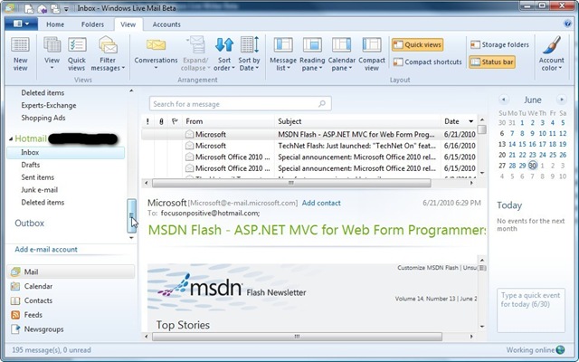
If you are a Windows Live Essentials user as I am, then you should give the new Windows Live Essentials beta a try. The beta product was released to public last week and finally I decided to install it. Among all Windows Live Essentials products, I use Windows Live Mail, Windows Live Messenger, Windows Live Writer, and Windows Live Sync, especially Windows Live Mail and Writer, I use them almost every day. The beta version includes some new features, which I will not waste your time to describe them and you can read them here if you are interested. What is very attractive to me is the new user interface of Windows Live Mail and Windows Live Writer. Windows Live Mail new interface looks very similar to Microsoft Outlook with the famous task-oriented ribbon on the top of the window, and a calendar and event side bar on the right.

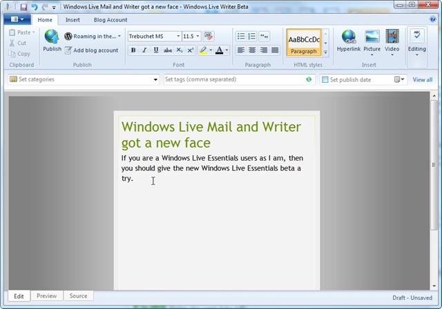
Windows Live Writer new interface looks similar to Microsoft Word, a task-oriented ribbon is placed on the top of the window with easy access to many commonly used features. The old side bar on the right was removed because all features are included in the ribbon. Finally, the blog post properties bar is moved up to be just underneath the ribbon area, which I think is more user friendly.

I especially like the new interface of Windows Live Writer that makes blogging much easier and faster, and I would recommend it to every friend of mine.


